
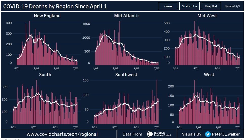
The charts below show the trends in COVID-19 deaths since April 1st for six different US regions. The regions are New England, Mid-Atlantic, Mid-West, South, Southwest and the West.
The trends show decreasing fatality trends since May 1st in four of the regions which include New England, Mid-Atlantic, Mid-West, and West.
Since May 1st the trend in the South has been declining and has recently flattened and is beginning to increase. In the Southwest, the death trend has been on the rise since June the 1st.
You can view trends in cases and hospitalizations for the six regions at this website: https://public.tableau.com/profile/peter.james.walker#!/vizhome/COVIDImpactbyRegion/Regions-P_


These charts do not use the same scale. They can not be used for visual regional comparison!
The scale of each graph has nothing to do with the trend it shows. The trending line (the white line used simply to better illustrate the trend of the individual columns of data) is either going UP or it is going DOWN. It is that simple. It doesn't matter whether one Region decreases from, say, 300 to 50 and another decreases from 350 to 100. It is still a decrease. The point is that both the South and the Southwest have a trend line that is going UP instead of DOWN. Granted the trend line of the South is a very gradual rise compared to the Southwest trend line, but it is going up, regardless of the scaled numbers. That is the only point being made here.
When one aggregates rocks - lead, salt, gold, coal and limestone are all "rocks". I've found rocks in 6 regions of the USA. I know a couple of 50 year olds in Oregon who claim to have had Covid19 with minor cases of the "symptoms" as listed by Florida Health but no actual testing. Other than that Leon County & Bay County with combined populations of half a million have had a dozen deaths. Is Chicken Little correct? Is the sky falling?