It has now become clear that the City of Tallahassee budget staff presented distorted facts about General Fund spending trends to City Commissioners at the inaugural budget workshop for fiscal year 2017 on April 13th.
This finding comes amid a request by citizens groups to roll back the 13% property tax increase passed last year.
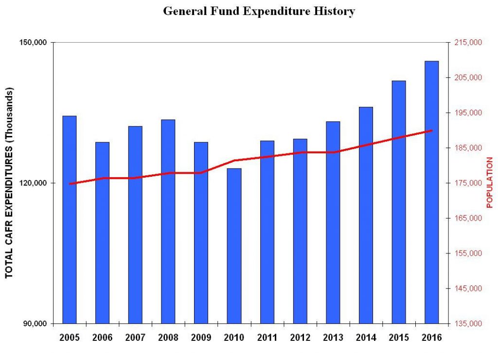
The issue was first publicly addressed by FSU Professor Shawn Kantor who spoke at a City Commission meeting on April 27th. Professor Kantor presented a chart that showed a steep increase in General Spending over the last six years when adjusting for City population growth.
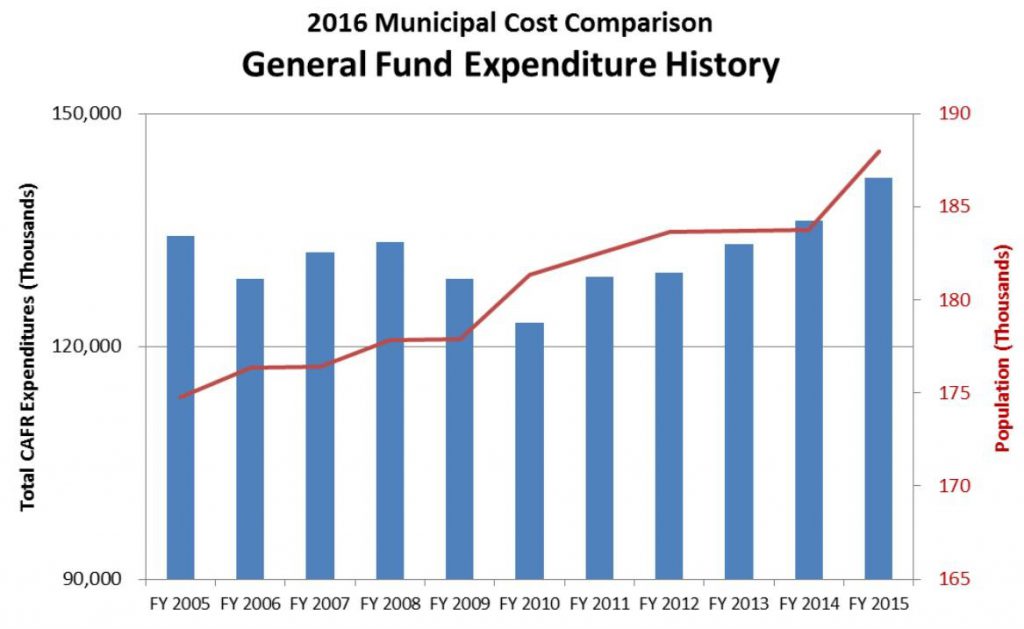
However, during the inaugural budget workshop, a chart presented to Commissioners by City staffer Robert Wigen showed spending climbing at the same rate as the City’s population.
This was not consistent with actual spending and population data.
In addition, Mr Wigen reinforced the visual representation by telling the City Commissioners that after 2010 spending increased “with a slight uptick but still below the population levels.”
Take a look and listen:
Given the fact that growth in the General Fund when compared to population is a pretty simple fact to verify, how did City staff create a chart that shows population growing at the same rate as the General Fund expenditures?
Why does a visual representation of population growth and General Fund not show what simple calculations do – that General Fund expenditures have increased at three times the rate of population?
This is where the distortion comes in and here is how it happened.
In the preparation of the chart, the City used different scales on the chart for city population and the General Fund expenditures. This distorted the relationship between the growth rate in population and expenditures.
Experts told TR that “statistical graphs with two vertical axes are particularly prone to manipulation and distortion: the impression of a reader will be very heavily influenced by what intervals are used and how the lines or bars are placed against each other.”
For example, the left part of the City chart includes 40% of the range from 0 to 150,000 while the right side of the chart shows approximately 14% of the range from 0 to 195,000. This set-up magnifies population growth and minimizes the growth in the General Fund.
By doing this, the population looks like it is rising with General Fund spending from 2010-2015 even though a simple calculation reveals something different.
What would a chart look like that used the same scale for population and the General Fund expenditures?
Listed below is a chart created using the same data , except using the same scale for population and General Fund spending.
Unlike the City created chart, the chart above shows that spending growth began to slowly outpace population growth after 2010 . The most significant increases have occurred in the last three years.
The City’s own data shows that the per person spending by the City in 2015 and 2016 is as high as the per person spending by the City just before the Great Recession in 2005.
The City staff has yet to provide this information to the City Commissioners. The next budget workshop is May 11th.
TR will continue to investigate the impact of this finding on the City’s budget decisions.


Forget the charts for a moment and look at the simple math. The years 2010-2015 are the most relevant years.
During these years, while recovering from 2008 plummeting real estate values that yielded lower tax revenues, general fund spending increased from about $123 million to $144 million (now $150 million) an increase of about $21 million or 17%.
During the same period the population grew only 3.7% from 181,000 t0 188,000.
The cost of living increases were minimal..last yr almost zero.
Staff said that general fund spending was about the same as population growth. Do you agree?
Steve, Does the City (or you) ever compare original budget to what they actually spend? I’m thinking they might end up with say a $2 million surplus at the end of the year, when it could have been $3 million surplus, but they overspent in some areas. We wouldn’t notice the overspending because they show us the $2 million profit and we focus on that. I know the City’s budget is multi layered, so it may be a lot of work if they don’t already compare this as part of their budget process from one year to the next.
The past City Auditor, now current City Manager is highly paid to manage the city’s budget; one would think he has precise knowledge of the City Budget, maybe he does.
Oh he knows alright! Right down to the penny. He knows exactly how much money he needs to extract from our pockets to “FEED THE BEAST”. What he doesn’t have a concept of is “budgeting and discipline”. But, sadly, he knows how to manipulate graphs and charts to make it look like he “needs” the increases he keeps taking….sighhh
Ambushed again? A crash course for the public on how to lie with statistics. The entire budget work process must be totally transparent. This is one of the results of commissioners staying too long and becoming too close to staff. The staff does all the work and commissioners vote however the staff recommends. The easy way, the way to avoid doing your homework is to just follow the staff guidance with an occasional showboat question.
So, between 2005 and 2016, total expenditure has increased about 7.5% while population has increased about 8.5%.
Nice try Chad. What other industries are at pre-recession levels? Home prices, wages, real estate sales, new construction…not even close! But the city is spending at 2005 bubble levels which is ridiculous. To take the numbers you took to compare are just as disingenuous as the city staff.
Read the last few stories carefully and, if needed, ask for someone to help. If a tenured, “distinguished” Professor of Economics is not able to show you the error of the City senior staff’s brazen effort to misrepresent the information – then you are likely friends with them. In the private sector this kind of misrepresentation on loan applications could garner someone jail time.
No two graphs with different Y axes good are necessarily good for comparison . Even the one produced by the “distinguished” Professor. (Your quotes). I was just pointing out that over an 11 year period, the percent expenditure increase has about matched population growth. Not sure why you guys get so hot under the collar when I just pointed out simple math. And yes, I DO think city staff showed bar grah data in a manner to justify increased expenditure. They should have used numbers and percentage. Bar graphs are a “waste of ink” ( a quote from one of my professors.)
Has any of the spending data presented been adjusted for inflation? The Professor’s original chart shows activity from 2000 to 2016, with per capita expenditures starting in 2000 at $690. Using the American Institute for Economic Research (AIER) cost of living calculator, the increase from a base year 2000 set to 100, to 2016 is about 37%. In constant, inflation adjusted dollars, 2016 per capita spending would have been approximately $945 per capita. The Professor’s chart shows considerably less than $945 per capita spending in 2016. So which is it? Which measure do you want to use? Additionally, the concept of every $1 of tax pulls $8 out of the economy is only selectively correct. It is fully correct when the tax dollars are removed from the economy – not spent locally; it is not fully correct when the money is re-invested locally, i. e. used to pay the dog catcher that is your next door neighbor.
And is this the same Preston Scott who is on the radio? I’m surprised. Instead if addressing my point, you insult (“ask someone for help”) and accuse a bias (“then you are likely friends with them.”) I would had thought you were more… thoughtful? At least based in your radio persona.
City Staff and the Commissioners are one and the same. Their Presentation is just a show for the farm animals who they consider to be the dumb taxpaying citizens.
But finally, someone decided to check their math.
The truth is they have been lying to us for years.
I am really not surprised. The city staff is a staff the public should view as “groupies” who see the commission members as akin to rock stars. They shape their numbers to gain the approval of the Gillum crowd.
Robert Wigen has told City Commission for years the Eletric utility will issue debt. It’s in every adopted budget. They have not issued debt in years. This means the rate study is overstated with a debt payment. Meaning we pay more. Where did that money go? To offset the base rate increase!